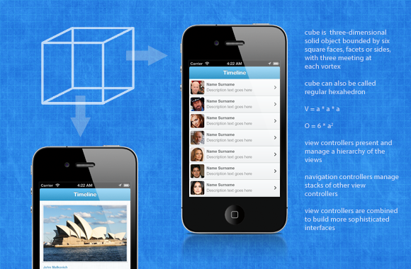
New iOS projects are always fun to work on, especially when they require some new concept. I’m about to show you concept for iPhone application which uses gesture based navigation and it is presented in such way that user have feeling he is rotating a cube while changing views. App views you are about to see are just for demo purpose, we still work on graphics, but you’ll be able see how this navigation concept works.
Standard solution for app navigation is tab bar based navigation: at bottom of the screen user can switch between one of several navigation views. When we look at iPhone screen size, standard tab bar covers 10% of screen size (height of tab bar is 49 pixels on pre-retina devices and 98 pixels on retina devices) which is a lot, especially since top part of screen will be used by status bar (20/40 pixels) and most probably navigation bar (44/88 pixels). To achieve better user experience in our apps we should show as much content as possible on iPhones 3.5 or 4 inch screen. Some applications like Facebook achieve this by hiding main menu “below” content views and this menu is usually accessed with button in navigation bar.
Idea of cube based navigation is that application consists of 4 views which have their navigation controllers. It is very common that applications (like Twitter app for example) have one main view which user use most of time (home or timeline), 2 additional views that provide some other features (thats connect and discover in Twitter app) and 1 more view that is usually profile or settings which user access the least. Project I work on have similar navigation flow and cube navigation allows user to change views by swiping left or right. Settings view is positioned as back of cube, so to access it user needs to swipe twice if starting view is main content view and in this case its not a problem since this view is not used very often.
In following video you can see application in action, user swipe left or right and access other views, swipe up and down are still used to browse content of screen.
From our experience and testing we can tell it is really easy for user to remember which features are on left side and which features are on right side of the cube. In this demo transition to other side of cube is just 0.3 seconds longer than standard push navigation and it doesn’t slow down use of application because user will most of time use first starting view. With such app concept we provide user interesting and different experience and that will most likely result that user remembers our application.
Leave Your Comment